

We have some graphic designers in our group, and they have a few tips for democracy fans who want to make a sign and wave it at one of our peaceful rallies.
First Tip: Have Fun, or Be Serious, or Work At It, oR pLaY
Below are some tips that could be construed as… ahem… “rules”. Don’t be fooled by appearances. These are not rules. You can do whatever you want with your sign… within bounds of the social, legal, and personal limits you choose for yourself.
If you want to have fun, do something fun. If you want to make a serious statement, be serious. If you want “peaceably to assemble, and to petition the Government for a redress of grievances”, then do that. That all sounds wonderful. You’ll find like minded folk at our events.
Consider The Distances
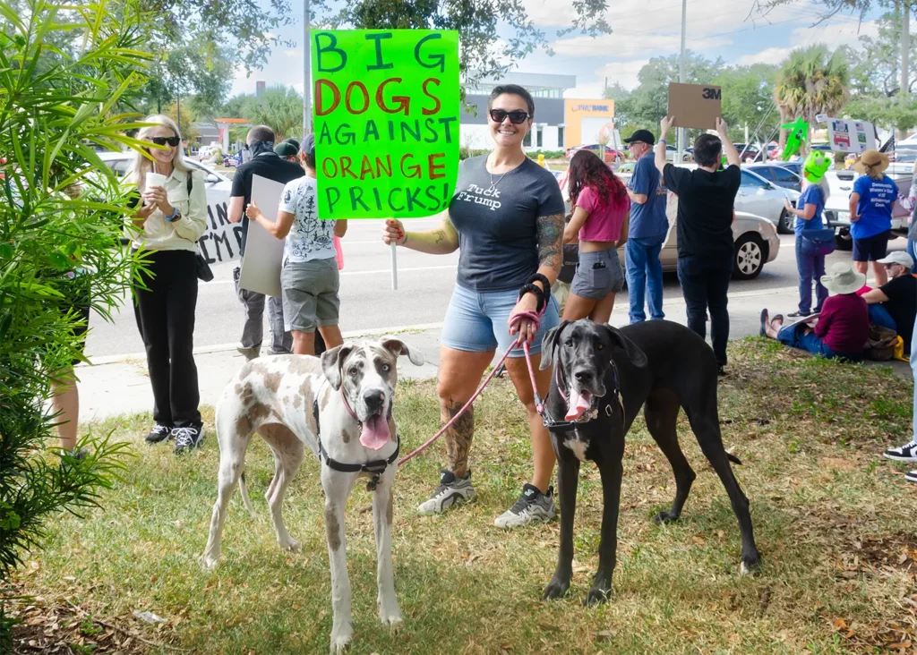
At our events, the distances from sign wavers to sign readers range from 5 feet to 200 feet. The further the reader, the bigger the text should be. Everybody understands this, but until you design and test signs, you might not appreciate how big text has to be for easy reading at 200 feet.
As a reference, road speed limit signs have numbers over 8 inches tall with a stroke of around 1 inch or more. We don’t have the requirements of road signs, but the basics still apply: use big text to be read at a long distance.
Some signs are for other people at the event; they are close, so text can be small. Some are for people in moving and stopped cars; they can be 20 to 200 feet away and have 1 to 20 seconds to read a sign, so text should be bigger for those people. And some signs are a mix; you can have big text and small text on your sign.
Generally Use Bigger Text
The most typical mistake of beginners is that text is too small, so double check your text size and test your sign or a draft mock up from a distance.
If you want to dig into text size, this link has several size calculators for distance and traveling speed:
Goes to another site, opens in a new window.
Heavy Letter Strokes
While we’re talking text size, use wide strokes. If you’re designing on a computer, use bold fonts that have wide strokes.
If you want your sign readable from across a major road, make the text bigger than you might think and with heavy strokes.
Simplify
Simply your message if needed.
A 2 x 3 sign meant for drivers across a big intersection needs big text. That means you can’t fit much on your sign, so it should be simple. People in moving cars sometimes have a few seconds to read a sign. A simpler message is easier to read.
Use High-Contrast Colors
Contrast refers to the difference between text color and the background. A deep black on a bright white background is the highest contrast.
When using magic markers, the sign material can bleed through and make a black marker look gray. Go over the text a few times to make the ink darker or use an opaque paint.
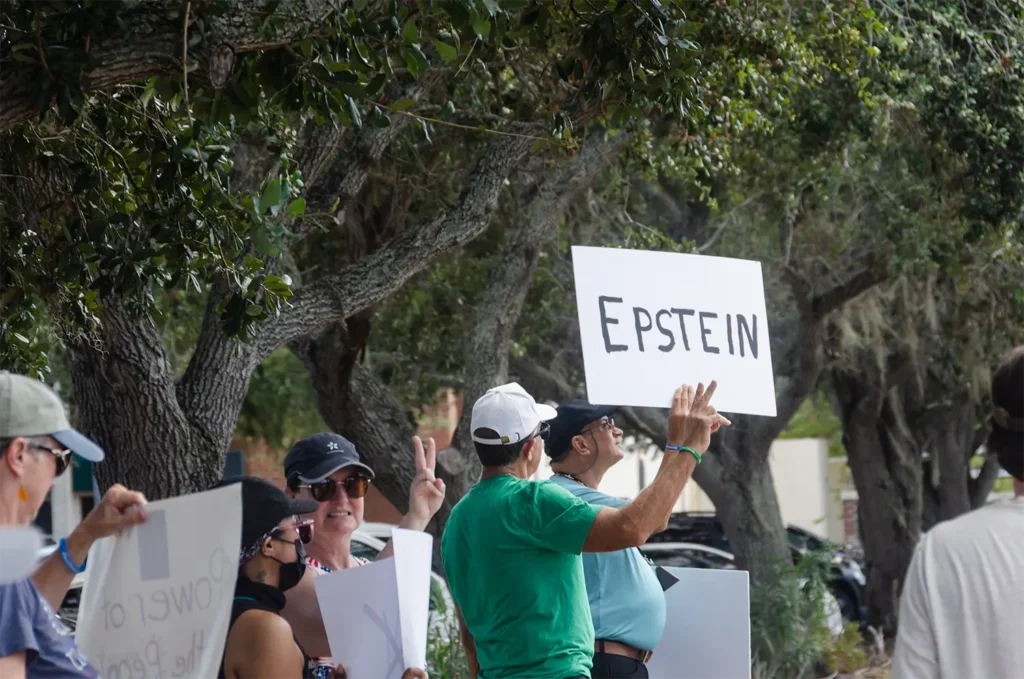
Tip: Design a Small Draft before Creating a Full-size Sign
This is an old trick. Work at a smaller size for a few drafts before making your sign at full size.
For designing hand-made signs, start with a 2 x 3 inch rectangle on a piece of paper, and write your text in that space. Then view it at arm’s length or further to test how readable it might be at poster board size (22 x 28 inches) from a distance.
If you’re designing on a computer, zoom out so the actual size on screen is about 3 inches wide. Then stand back from the monitor to test readability.
Example: Sea of Signs at Different Sizes
Finally, here’s an example. A picture of a group of signs is displayed multiple times, each time smaller than the previous. It simulates what you might see as you get farther away. Of course, it depends on your screen size.
On computers and tablets, all or most signs are readable in the first image:
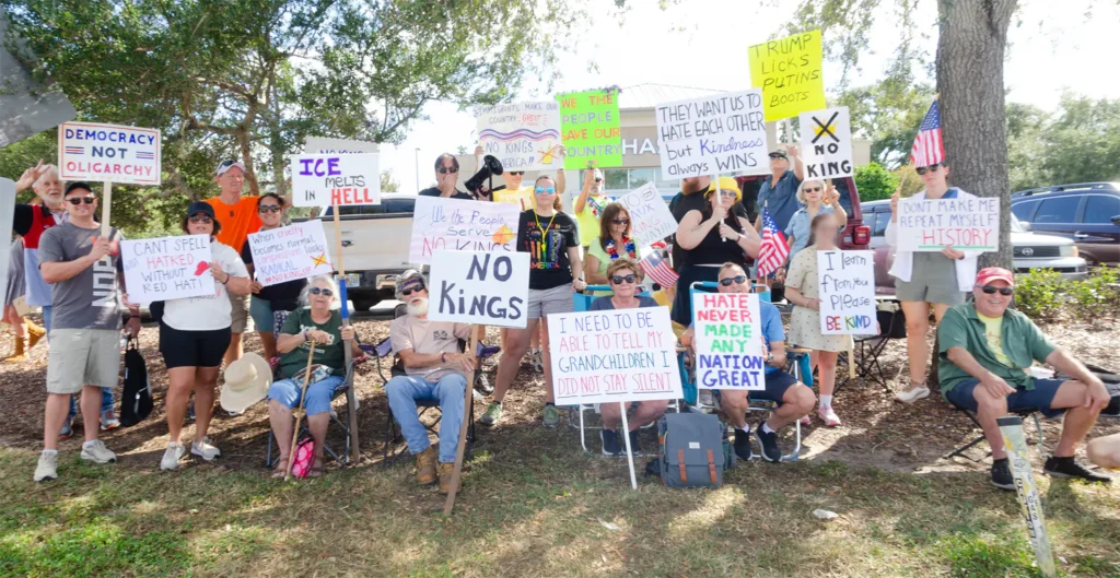
As the image gets smaller or as you get farther away, signs with small text or low contrast become unreadable sooner.
Have Fun and See You At the Rally
To summarize: Have fun or be serious; that’s your choice. Generally if you want people in cars to read your sign read, make text bigger than you might think. First create a draft at a small size before making your full-size sign.
Have fun with all your sign crafting. We look forward to seeing you wave your fine art at the next rally.